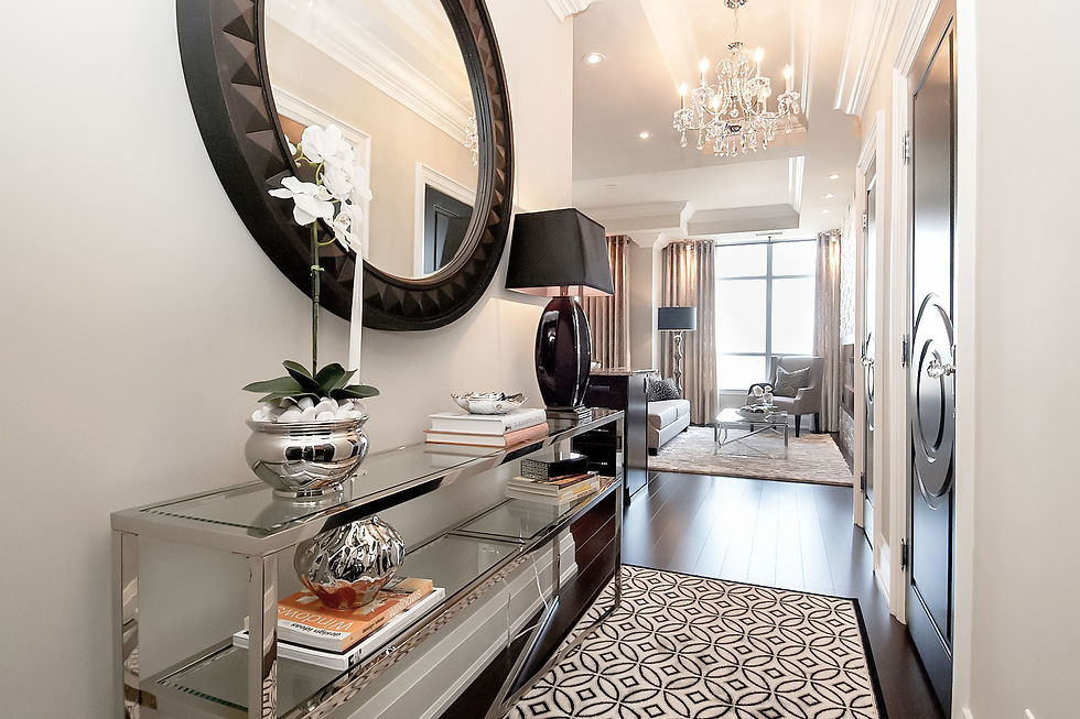
Benjamin Moore Edgecomb Gray HC-173 — The Soft Neutral Homeowners Love
- Lenore LDI

- Nov 22, 2025
- 4 min read
Updated: Jan 21
If you love warm, timeless neutrals — but don’t want anything too beige or too gray — Benjamin Moore Edgecomb Gray HC-173 might be the perfect paint colour for your home. It’s one of those rare shades that feels calm, creamy, airy, and endlessly adaptable.
I recommend this colour often for clients who want a soft, organic backdrop that works with both modern and traditional elements. It’s subtle, sophisticated, and incredibly forgiving — especially in homes with mixed natural light.

Let’s dive into why this colour works so well, where to use it, and how to pair it beautifully.
What Makes Edgecomb Gray HC-173 So Popular?
A perfectly balanced “greige”
Edgecomb Gray sits right between gray and beige — truly a warm greige. It never feels too cool, flat, or muddy.
Soft and airy
It has a light reflectance value (LRV) of 63, meaning it reflects a lot of light and keeps rooms feeling bright.
Warm, but not yellow
This is the secret: Edgecomb Gray’s warmth feels natural, not golden or peachy.
Works with ANY design style
Modern? Transitional? Traditional? Farmhouse? Edgecomb Gray adapts beautifully — it never dominates the room.
How Edgecomb Gray Reads in Different Lighting
Lighting changes everything — especially with neutrals.
North-Facing Rooms
Appears more muted and slightly cooler
Lovely paired with soft whites, warm woods, and warm metals
Doesn’t go blue, which is why I often choose it over cooler grays in these rooms
South-Facing Rooms
Looks warm and creamy without going yellow
Feels calm and sunlit at the same time
East-Facing Rooms
Morning: warm and soft
Afternoon: lightly shaded and muted
Avoid pairing with very cold grays here — choose warmer accents to balance
West-Facing Rooms
Gets rich and glowy in late afternoon light
Works beautifully with natural textures (linen, rattan, white oak)
Where Edgecomb Gray Works Best
Living Rooms & Open-Concept Spaces
Creates a warm, cohesive feel that flows through adjoining rooms.
Hallways & Entryways
Softens darker areas without making them feel flat.
Bedrooms
Pairs well with warm whites, earthy tones, and soft blues.
Kitchens
Perfect with white or light wood cabinetry — warm enough to soften hard surfaces.
Condos
Toronto condos often have varied natural light; Edgecomb Gray stays consistent throughout the day.
Designer Pairings That Always Work
Trim & Ceiling Colours
Pair Edgecomb Gray with a crisp or soft white for a clean, timeless look:
BM White Dove OC-17 (soft, warm white — my go-to)
BM Chantilly Lace OC-65 (crisp and bright)
BM Cloud White OC-130 (gentle and classic)
Accent Colours
For a subtle, elevated palette:
Soft white
Clay beige or warm taupe
Dusty blue
Sage green
Black or charcoal accents
When You Want More Contrast
Try:
Hale Navy HC-154
Wrought Iron 2124-10
Storm AF-700
Edgecomb Gray vs. Other Popular Neutrals
Edgecomb Gray vs. Revere Pewter
Edgecomb = lighter, more airy, less taupe
Revere Pewter = moodier, deeper, more traditional
Edgecomb Gray vs. Pale Oak
Pale Oak = slightly pinker undertone
Edgecomb Gray = more earthy and grounded
Edgecomb Gray vs. Classic Gray
Classic Gray = cooler and brighter
Edgecomb Gray = warmer and more versatile
When working with tighter refresh budgets, matte or eggshell finishes with Edgecomb Gray can hide many wall imperfections — especially in older Toronto homes or spaces with wear and tear.
Benjamin Moore Edgecomb Gray HC-173 is one of those timeless neutrals that quietly elevates a space without ever feeling boring. It’s warm, soft, and endlessly flexible — perfect for Toronto homes with varied lighting and mixed materials.
If you’re unsure whether Edgecomb Gray is right for your space — or how to pair it with your existing finishes — I can help you find the perfect palette.
Want a curated shortcut? I’ve put together a free Top Paint Colours for 2026 guide featuring my favourite Benjamin Moore and Sherwin-Williams picks — plus practical tips on where to use them, how light affects each shade, and common painting mistakes to avoid.

“The best colour trends aren’t about what’s new — they’re about what still feels right five years from now.”
In 2026, the most successful interiors will be built on flexible, warm, and thoughtfully chosen paint colours — ones that allow furnishings, textures, and lifestyle to shine.
The 2026 colour trends reflect a deeper shift in how we design our homes — toward comfort, warmth, and intention. These palettes are less about making a statement and more about creating spaces that feel good to live in, day after day.
When chosen thoughtfully, colour becomes the quiet foundation that allows your home to feel cohesive, calm, and personal — now and in the years ahead.
If you’re considering a refresh, renovation, or new build in Toronto or the GTA, I always recommend starting with a plan. Colour decisions are far more successful when they’re part of a complete design strategy.
Book a Design Consultation to choose a paint colour you’ll love for years.

Thanks for reading!
Lenore 🤍


Comments