The Best Paint Colours for South-Facing Rooms
- Lenore LDI

- Oct 31, 2025
- 3 min read
Updated: Nov 2, 2025
Balancing bright, warm light with the perfect paint palette
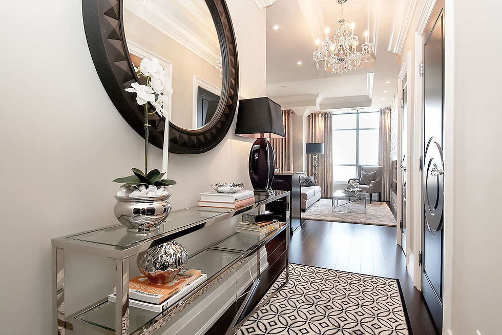
South-facing rooms are the sunniest spaces in your home. They’re filled with warm, golden light for most of the day, which can make colours glow beautifully… or, sometimes, a little too much.
In Toronto and across Canada, these spaces often feel cheerful and bright even in winter, which is a major bonus. But that strong southern exposure can intensify undertones — making warm colours look warmer, cool colours feel softer, and bright hues almost blinding in the afternoon sun.
The good news? With the right paint colours, you can balance that gorgeous natural light to create rooms that feel fresh, calm, and just right all day long.

Understanding South Light
• Tone: Warm and golden, especially midday.
• Intensity: Brightest exposure — strong, direct light.
• Effect on Paint: Warm colours get amplified; cool tones look fresher and crisper; whites can look dazzling or too stark.
Translation: South-facing rooms can handle cooler hues beautifully, but you need to be careful with overly warm or intense shades.
Best Colour Strategies for South-Facing Rooms
1. Crisp Whites & Fresh Neutrals Shine Here
South light naturally warms everything, so cooler whites and balanced neutrals are your best friends. They keep spaces feeling airy without tipping too warm.
Benjamin Moore favourites:
• Chantilly Lace (OC-65) — a clean, bright white that glows in southern light.
• Decorator’s White (OC-149) — a soft white with subtle gray undertones, perfect for modern spaces.
• Gray Owl (OC-52) — a light gray-green neutral that reads fresh, not cold.
• Wickham Gray (HC-171) — a delicate gray-blue that balances warm light beautifully.

Sherwin-Williams favourites:
• Pure White (SW 7005) — a flexible soft white that works beautifully with bright light.
• First Star (SW 7646) — a cool, modern gray with a soft blue undertone.
• Sea Salt (SW 6204) — that soft green-gray that always photographs beautifully.
• Nebulous White (SW 7063) — light, crisp, and subtly cool.

2. Cool & Muted Colours Calm the Glow
South-facing rooms love cooler tones — think airy blues, soft greens, misty grays, or muted taupes. These shades counterbalance the warmth of the light, so your space feels calm instead of overheated.
Benjamin Moore:
• Horizon (OC-53) — soft, misty gray-blue; ideal for bedrooms or living rooms.
• Healing Aloe (1562) — gentle green-gray that feels fresh and spa-like.
• Stonington Gray (HC-170) — a timeless cool gray that stays elegant in warm light.

Sherwin-Williams:
• Misty (SW 6232) — soft blue-gray that feels serene and balanced.
• Rainwashed (SW 6211) — light green-blue with a refreshing feel.
• Silver Strand (SW 7057) — cool, layered gray-green that photographs beautifully.

3. Use Warm Colours Intentionally
South-facing light will intensify warm shades like yellows, reds, and oranges. These can still be stunning, but it’s best to stick to muted, less saturated versions so they don’t feel overwhelming midday.
Benjamin Moore:
• Lenox Tan (HC-44) — warm but grounded; perfect for traditional spaces.
• Muslin (OC-12) — soft neutral with gentle peachy warmth.

Sherwin-Williams:
• Natural Linen (SW 9109) — a soft, warm neutral that doesn’t overpower.
• Alabaster (SW 7008) — a soft, warm off-white that glows gently in sunlight without tipping yellow.

Designer Tips for Testing Paint in South-Facing Rooms
• Watch it at different times of day: Southern light shifts dramatically from soft morning to intense midday.
• Cool colours can shift warmer: What looks blue-gray on a chip might lean greenish at noon.
• Bright whites can dazzle: If you love crisp white, consider a satin or matte finish to diffuse glare.
• Sample generously: Always test large swatches on at least two walls.
Lenore’s Designer Palette for South-Facing Rooms
Category | Benjamin Moore | Sherwin-Williams |
White | Chantilly Lace OC-65, Decorator’s White OC-149 | Pure White SW 7005, Nebulous White SW 7063 |
Neutral | Gray Owl OC-52, Wickham Gray HC-171 | Sea Salt SW 6204, First Star SW 7646 |
Colour | Healing Aloe 1562, Stonington Gray HC-170 | Misty SW 6232, Rainwashed SW 6211 |


Why This Matters in Toronto Homes
South-facing spaces in the GTA often feel warm and bright even in the depths of winter. Choosing cooler, balanced tones keeps these rooms feeling fresh and welcoming year-round — especially in modern homes with big windows and open-concept layouts.
South-facing rooms are a designer’s dream. With all that beautiful natural light, you have more flexibility than any other exposure — but you need to choose wisely to avoid colour overload. Lean into cooler tones, crisp whites, and balanced neutrals, and your space will feel bright and elegant in every season.
Need help narrowing it down or choosing colours for a south-facing room? I can create a custom palette for your home that looks beautiful all day long.

Thanks for reading!
Lenore 🤍


Comments