The Best Paint Colours for North-Facing Rooms
- Lenore LDI

- Oct 6, 2025
- 4 min read
Updated: Jul 12
How to choose paint colours that bring warmth and balance to cooler light
If you’ve ever painted a room a gorgeous soft white… only to have it look cold and gray once it’s on the wall, there’s a good chance that room faces north.
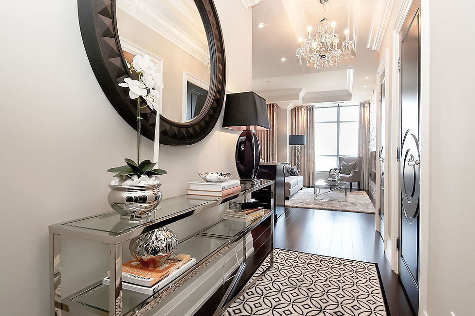
North-facing rooms receive cool, indirect light throughout the day. It’s soft and consistent but often has a gray-blue undertone that can make colours look muted or chilly. In Toronto and across Canada, this effect is even stronger during winter months when natural light is limited and cooler in tone.
But don’t worry — with the right paint colours, a north-facing space can feel cozy, balanced, and beautiful all year round. Here’s how to choose wisely.

Understanding North Light
• Tone: Cool, often with a slight blue or gray cast.
• Intensity: Consistent but softer than southern exposures.
• Effect on Paint: Warm tones become more subdued, cool tones can feel icy, and whites often look dingy or shadowy.
Translation: North-facing rooms need colours that add warmth and depth, not take it away.
Best Paint Colour Strategies for North-Facing Rooms
1. Lean Into Warm Neutrals & Soft Whites
Cool northern light can make “pure” whites look flat or cold. Instead, opt for warm whites and soft neutrals with yellow, red, or beige undertones to counterbalance the cool light.
Benjamin Moore favourites:
• White Dove (OC-17) — a soft, warm white that stays elegant and never too yellow.
• Cloud White (CC-40) — classic creamy white with gentle warmth; great for trim or walls.
• Classic Gray (OC-23) — a light warm greige that adapts beautifully to changing light.
• Revere Pewter (HC-172) — a versatile warm greige that grounds a space without feeling heavy.
Sherwin-Williams favourites:
• Alabaster (SW 7008) — a designer go-to warm white; soft and glowing in cool light.
• Greek Villa (SW 7551) — creamy and warm without reading yellow.
• Drift of Mist (SW 9166) — a warm, light neutral perfect for subtle contrast.
• Accessible Beige (SW 7036) — warm greige with enough depth for north-facing living rooms.
2. Consider Muted Warm Colours
Instead of bright or pure colours, choose muted versions of warm tones — these look more sophisticated and hold their warmth even under cool light. Think soft blushes, dusty terracotta, muted ochres, or gentle sage greens with yellow undertones.
Benjamin Moore:
• Saybrook Sage (HC-114) — soft, warm green that feels calm and organic.
• Lenox Tan (HC-44) — a muted warm tan that adds coziness without darkness.
• Muslin (OC-12) — light creamy neutral with a touch of peach warmth.

Sherwin-Williams:
• Sea Salt (SW 6204) — soft green-gray with warmth; works beautifully with northern light.
• Natural Linen (SW 9109) — warm neutral with just enough colour.
• Honied White (SW 7106) — subtle warm undertone, excellent for whole homes.

3. Avoid Stark Whites & Cool Grays
Crisp, cool whites like BM Chantilly Lace or SW Extra White can look sterile or bluish in north light. Similarly, cool grays can turn icy and flat. If you love a cooler palette, balance it with warm lighting and soft furnishings to prevent the room from feeling cold.
Designer Tips for Testing Paint in North-Facing Rooms
• Sample on multiple walls: Northern light hits differently across a room — test near windows and deeper interior walls.
• Check at different times of day: Morning vs afternoon can shift tones subtly.
• Go larger with swatches: 18×18 samples give a truer read than small chips.
• Layer your lighting: Use warm-temperature bulbs (2700–3000K) to add cozy glow when natural light is cool.
Lenore’s Designer Palette for North-Facing Rooms
Category | Benjamin Moore | Sherwin-Williams |
White | White Dove OC-17, Cloud White CC-40 | Alabaster SW 7008, Greek Villa SW 7551 |
Neutral | Classic Gray OC-23, Revere Pewter HC-172 | Drift of Mist SW 9166, Accessible Beige SW 7036 |
Colour | Saybrook Sage HC-114, Muslin OC-12 | Sea Salt SW 6204, Honied White SW 7106 |


These combinations bring warmth and sophistication to north-facing spaces without feeling heavy — perfect for living rooms, bedrooms, or offices.
Why This Matters in Toronto Homes
In the GTA, where we experience cooler daylight for much of the year, north-facing rooms can feel shadowy or stark if painted incorrectly. Choosing the best paint colours for north-facing rooms such as warm whites and muted tones creates a soft, welcoming environment that feels balanced in every season.
North-facing rooms might have cool light, but with the right paint colours and interior design choices, they can be some of the most serene spaces in your home. Lean into warmth, avoid harsh whites, and always test in your actual light.
Loved these tips? Here's more, free:
Not sure what your style is? Take our free 1-minute Style Quiz
Grab our free guide, "10 Things Your Decorator Knows That You Don't"
Want the full playbook? The Interior Designer's Rulebook has 250+ of the tips we use on every project
If you’re unsure where to start, I’d love to help create a paint palette tailored to your space. A thoughtful choice today will make your room glow for years to come.

Thanks for reading!
Lenore 🤍

Comments