Benjamin Moore Revere Pewter (HC-172): The Timeless Neutral Paint Colour Homeowners Love
- Lenore LDI

- Sep 5, 2025
- 4 min read
Updated: Dec 27, 2025
Choosing the right neutral paint colour can feel overwhelming. With so many shades of grey, beige, and white to choose from, how do you know which one will look best in your home? Enter the timeless neutral paint colour HC-172 Revere Pewter by Benjamin Moore— a timeless “greige” paint colour that homeowners, designers, and builders can’t stop recommending.
What Colour Is Revere Pewter?
Revere Pewter is a warm grey with beige undertones, often described as the “perfect greige.” It has a slight green undertone that can shift to purple in some light. It’s soft, versatile, and easy to live with, making it one of Benjamin Moore’s most popular paint colours year after year.
With a light reflectance value (LRV) of 55, Revere Pewter reflects a comfortable amount of light. This means it won’t feel too dark in smaller rooms but also won’t get washed out in spaces with lots of natural light.
Why Homeowners Love the timeless neutral paint colour by Benjamin Moore HC-172 Revere Pewter
• It’s timeless. Revere Pewter has been a go-to neutral for over a decade — and it still feels fresh.
• It works with any style. Whether your home leans modern, traditional, or farmhouse, this shade blends right in.
• It adapts to lighting. In bright daylight it feels airy; in the evening it takes on a cozy, inviting look.
• It boosts resale value. Realtors often recommend it because it appeals to a wide range of buyers.
Why Revere Pewter It’s Perfect for New Builds
If you’re designing or moving into a new build, timeless neutral paint colour HC-172 Revere Pewter is a smart choice for a whole-home colour.
• Creates Flow: Open-concept floor plans feel cohesive when painted in one consistent shade, and Revere Pewter ties spaces together beautifully.
• Design Flexibility: With a brand-new home, you’re often starting from a blank canvas. This balanced neutral makes it easy to layer in your own style through furniture, lighting, and décor.
• Pairs with Modern Finishes: From quartz countertops to wide-plank flooring and black hardware, it complements today’s most popular materials.
• Resale Appeal: If you’re building with the future in mind, this neutral appeals to almost every buyer.
• Practical for Everyday Life: Because it’s not too stark or too dark, it’s more forgiving with scuffs and marks than pure white walls.

Where to Use Revere Pewter in Your Home
This versatile shade works beautifully everywhere, but here are some of the best spots:
• Living Rooms & Open Floor Plans – Creates a warm, neutral backdrop that ties spaces together.
• Bedrooms – Relaxing, soft, and never too stark.
• Kitchens – Stunning with white cabinets, black hardware, or warm wood accents.
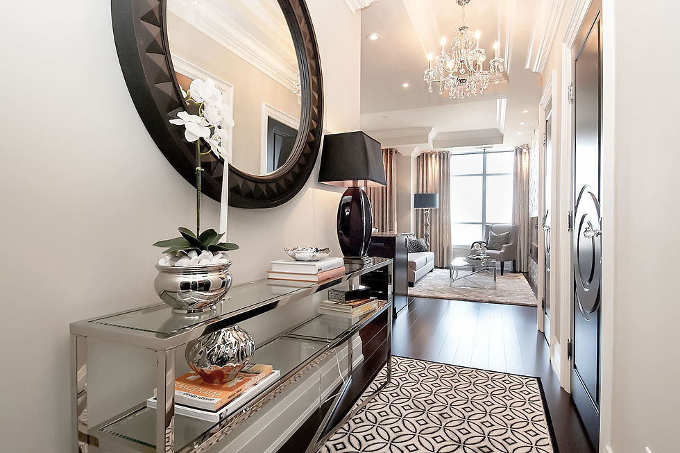
• Hallways – A great “whole-home” colour that makes transitions seamless.
Colours That Pair Well with Revere Pewter
• Trim & Ceilings: Crisp whites like Benjamin Moore
Simply White (OC-117) or
White Dove (OC-17).
• Accent Colours: Deep navy, forest green, or charcoal for contrast.
• Wood Finishes: Complements both light oak floors and darker stains like walnut.
If you’re searching for a timeless neutral paint colour that feels warm, inviting, and sophisticated, you can’t go wrong with Benjamin Moore HC-172 Revere Pewter. Whether you’re refreshing one room, tying together a whole home, or selecting finishes for a new build, this timeless greige adapts beautifully and gives your space an effortless sense of style.
At Ldesigns Interiors, we love recommending colours that bring out the best in your home — and Revere Pewter is one of our favourites for its versatility, warmth, and staying power. Check out our portfolio for more examples of this great colour in action.
I’ve put together a free Top Paint Colours for 2026 guide featuring my favourite Benjamin Moore and Sherwin-Williams picks — plus practical tips on where to use them, how light affects each shade, and common painting mistakes to avoid.

“The best colour trends aren’t about what’s new — they’re about what still feels right five years from now.”
In 2026, the most successful interiors will be built on flexible, warm, and thoughtfully chosen paint colours — ones that allow furnishings, textures, and lifestyle to shine.
The 2026 colour trends reflect a deeper shift in how we design our homes — toward comfort, warmth, and intention. These palettes are less about making a statement and more about creating spaces that feel good to live in, day after day.
When chosen thoughtfully, colour becomes the quiet foundation that allows your home to feel cohesive, calm, and personal — now and in the years ahead.
If you’re considering a refresh, renovation, or new build in Toronto or the GTA, I always recommend starting with a plan. Colour decisions are far more successful when they’re part of a complete design strategy.

Thanks for reading!
Lenore 🤍


Comments